The final product is based on the two words Metallic (Shinya) and Delicate (Antonio). During this time, I had an extremely hard time learning how to use sketchup and trying to think of a way of combining two spaces so that I would be able to bring in the 'datum' concept into the design. My original sketch involved Shinya's space to be more angular with the triangular pyramids, where as the underground area was meant to be a space which was something extremely angular with lots of equilateral triangular pyramids.
Original Sketch (A1/A2 - Sketch 1)
Draft Model
I developed the sketch into a draft model, which showed two really different buildings, which did not really have the 'datum' concept in it.
Finally, I changed the above area into something which seems to be extremely different by getting rid of three of the triangles and making the two top triangles as parallelograms. However, I kept the underground area pretty much the same, except for the interior, which was more interesting than the empty room from before. Additionally, I got rid of all the fancy stuff on the top, as it was distracting and too much, since it was meant to be the gallery space and that it was not helping to unify the two spaces.
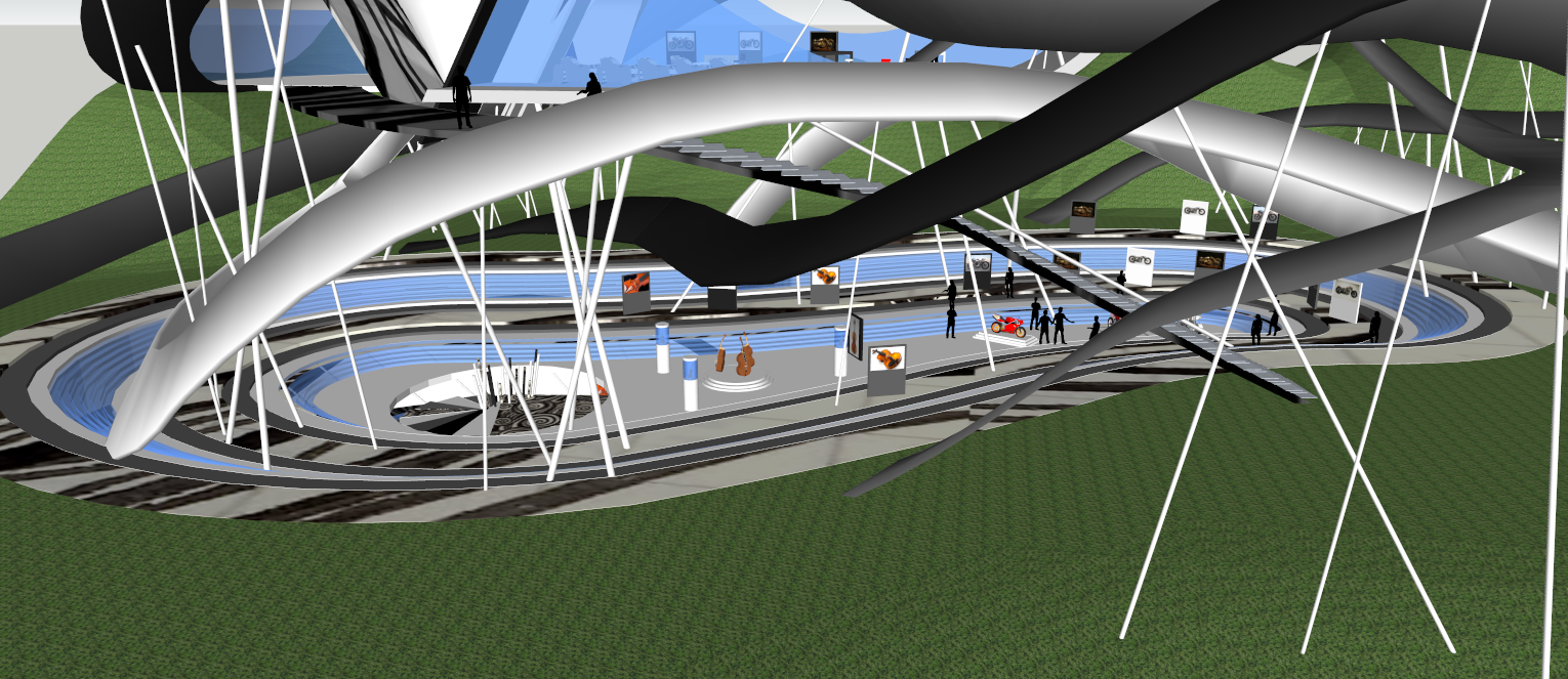
Final Model
The above ground space consists of a small tunnel with a wide open space which has ramps going in and out of it. This structure is wrapped by many poles and a few ramps, which could easily be said to be inspired by a rollercoster ride. The use of the poles was an important in this design, sicne it was something that connected the two spaces together. While researching on the two clients, I found one thing really similar in their works, which was the use of curves and sleek shapes of their works. But what was even more similar was the use of thin material. Shinya used thin poles and tubes in order to create engine pipes and things like that on his motorcycle. As for Antonio, the strings on his string isntruments were extremely delicate components and were something that could connect the two clients together.
The stairs

For the above ground, it can be seen that there's a a ramp which seems to be coloured in two colours. This ramp is based on my 4th stair sketch and acts as a way of getting to Shinya's Space for those who are incapable of riding a motorcycle into Shinya Kimura's Studio. The use of two different colours and texture allows it to stand out more from the other ramps. Additionally, it can be seen that the steps are at different lengths and are shifted to the left and right. This creates a concept of 'delicate walking' and freedom, since the visitors and guests would have to be careful of how to walk, as the steps are never positioned exactly the same. This idea was inspired by the idea of riding a motorbike, when one feels free and excited as they ride a motorbike down ramps and through different obstacles (like in movies). In terms of functionality, only two of the ramps inside the model can be used for riding a motorcycle around the building. The other 'ramps' are there to improve the aesthetic side of the upper ground area. The two that are function are the ones which go into the building. in the third image below, it can be seen that a dark ash coloured ramp goes into the left hand tunnel of the building, where as another ramp, coloured grey, sits inside of the other side of the building and creates a simple U turn down onto the ground. The dark ash coloured ramp brings back in the idea of freedom as the way it curves is rather interesting, and would be quite a ride for a motorcyclist.


For Antonio, the spiral staircase was created for him, which was based on my 2nd sketch, the spiral stairs. This stair is unique as the the width and length of the steps increases as it goes up, which differentiates it from a typical staircase. The slanted pillars in the middle are the things which give the steps support. Additionally, both stairs have no balustrade, since I wanted to create a sense of delicateness by using thin steps and poles.

The stair is used in two spots of the design, one as the main entrance for those who come in from the outdoor gallery, and one as an entry to Stradivari's small studio, where he quietly works on crafting new musical instruments.
Implemented Textures
 |
| Smooth |
 |
| Flexible |
 |
| Swirl |
Smooth was used cause it imitated the way the underground building's ceiling shape. In order to create a greater emphasis on it, I decided to use it for the floor and gallery spot. As it can also be seen, the outdoor gallery showcase area is actually part of the the underground building. Additionally, it was used in the staircase so that it could help the staircase stand out more.
The texture swirl was used as the main texture of the poles and steps for Antonio's staircase. Swirl was used because the way the the staircases moved was like an imitation of a coral, they way it would spiral in. The use of this texture was also to bring a greater emphasis on the staircase.
Finally, the last texture, flexible, was used for the top building cause I wanted to make that top piece on the tunnel to blend in with the other ramps. The ramps and the strips on the roof were very flexible, but the roof piece on the tunnel wasn't, so as an attempt to bring it all together, I used it as a way of bring everything together.
Links to Non-Assessed Outcomes:
Links to Assessed Outcomes:


.PNG)
.PNG)
.PNG)